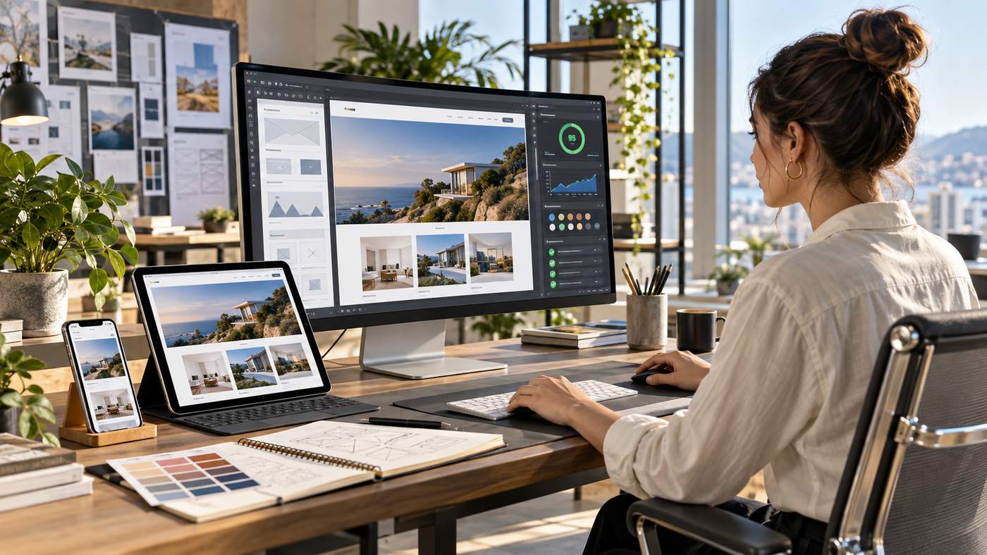
Web Design: How to Build a Website People Actually Want to Use
A successful web design combines visual appeal, usability, accessibility, performance and clear communication into one consistent digital experience. A website should not simply look impressive on a large monitor. It should help visitors understand where they are, find information quickly, complete important actions and use the site comfortably across smartphones, tablets and desktop computers. Google recommends responsive web design for mobile friendly sites, while the World Wide Web Consortium encourages designers and developers to use accessibility standards such as WCAG 2.2 when creating digital experiences.
Modern websites often have only a short period of time to communicate their purpose. Visitors should immediately understand what a company offers, who the service is for and what they can do next.
Good design therefore begins with strategy rather than decoration.
Colours, typography, animation and imagery matter, but they should support the user’s goals instead of distracting from them.
This guide explains seven essential principles that can help businesses, designers and developers create websites that are attractive, responsive, accessible, search friendly and easier to use.
What Is Web Design?
Web design is the process of planning and creating the visual structure, user interface and overall experience of a website.
It includes much more than choosing colours and images.
A complete website design can involve:
- Page layout
- Navigation
- Typography
- Colour systems
- Images and video
- Calls to action
- Mobile responsiveness
- Accessibility
- User experience
- Search visibility
- Performance
- Conversion design
Designers may work closely with developers, writers, SEO professionals, marketers and business owners.
The objective is to turn information and business requirements into a digital experience that people can understand and use.
A visually impressive site that is difficult to navigate is not necessarily effective.
Likewise, a technically fast website may still perform poorly if visitors cannot understand the offer.
The strongest websites balance design, content and technology.
7 Essential Web Design Principles for Better Websites
1. Web Design Should Start With the User
One of the biggest mistakes in website creation is designing primarily around what the business wants to show rather than what visitors need to accomplish.
A user centred approach begins by identifying the likely visitor.
Ask questions such as:
- Why did this person arrive?
- What information are they looking for?
- What action should be easy to complete?
- What questions might prevent them from taking action?
- Which device are they likely to use?
A local service business, for example, may need to make phone numbers, service areas and booking options highly visible.
An ecommerce website may need to prioritize product discovery, pricing, shipping information and checkout.
A professional services site may need to communicate expertise and encourage consultation requests.
These sites should not all use exactly the same structure.
User Experience and Web Design
User experience, often shortened to UX, describes how someone feels and behaves while interacting with a website.
Good UX reduces unnecessary effort.
Visitors should not need to guess where a button leads or search through several pages to find basic information.
Strong UX commonly includes:
- Predictable navigation
- Clear headings
- Readable content
- Logical page hierarchy
- Consistent buttons
- Helpful forms
- Obvious next steps
Google’s page experience guidance also encourages website owners to consider the overall user experience rather than focusing on one isolated performance signal.
2. Responsive Web Design Is Essential
Websites are accessed through screens of many different sizes.
A layout that looks excellent on a desktop monitor can become difficult to use when viewed on a smartphone.
Responsive design allows the layout to adapt according to available screen space.
Google recommends responsive web design because it uses the same URL and HTML while adjusting the presentation for different screen sizes.
This can simplify management while providing a consistent experience.
What Responsive Web Design Should Consider
Responsive design involves more than shrinking everything.
Designers should reconsider how content behaves on smaller screens.
Important elements include:
- Navigation menus
- Images
- Forms
- Buttons
- Tables
- Typography
- Spacing
- Multi column layouts
A three column desktop section may become a single column on a phone.
A large menu may become a compact navigation control.
Images should scale without overflowing the screen.
Buttons should remain easy to tap.
Mobile Content Should Remain Complete
Google uses mobile first indexing, meaning the mobile version of a site’s content is used for indexing and ranking. Google recommends making important content and metadata available on mobile as well as desktop.
Designers should therefore avoid treating mobile users as if they need a stripped down version of the website.
The layout can become simpler, but important content should remain accessible.
3. Clear Navigation Makes Websites Easier to Use
Navigation is the system that allows visitors to move through a website.
A complicated navigation structure can make a relatively small site feel confusing.
The main menu should normally focus on the most important areas.
For a service company, these might include:
- Home
- About
- Services
- Projects
- Blog
- Contact
A large ecommerce or information site may require more advanced navigation.
The principle remains the same.
Visitors should understand the structure without needing instructions.
Create a Logical Information Hierarchy
Every website has an information hierarchy.
The homepage sits at one level.
Main category or service pages form another.
Supporting content appears beneath those categories.
A clear hierarchy helps users understand relationships between pages.
It also supports internal linking and search engine crawling.
Google advises developers to make websites understandable and search friendly and notes that design choices can affect how easily Search understands a site.
Use Descriptive Navigation Labels
Creative wording may appear distinctive, but navigation should prioritize clarity.
A button labelled “Our Work” is usually easier to understand than an abstract phrase that gives no clue about where it leads.
Visitors should not need to interpret the interface.
Clear labels reduce uncertainty.
4. Web Design Should Support Accessibility
Accessible design helps people with different abilities use websites effectively.
The World Wide Web Consortium maintains the Web Content Accessibility Guidelines, commonly known as WCAG.
WCAG 2.2 is a W3C Recommendation and is organised around four core principles: content should be perceivable, operable, understandable and robust.
Accessibility considerations can include:
- Colour contrast
- Keyboard navigation
- Text alternatives for images
- Form labels
- Focus indicators
- Captions for multimedia
- Clear headings
- Understandable instructions
- Appropriate touch target sizes
W3C notes that accessibility guidance benefits people with visual, physical, hearing and cognitive disabilities and can also improve usability more broadly.
Colour Contrast in Web Design
A light grey paragraph on a white background may look minimalistic but can be difficult to read.
Designers should choose colours that maintain sufficient contrast.
Important information should not depend entirely on colour.
For example, an error message should not only turn a field red.
It should also clearly explain what needs to be corrected.
Keyboard Accessibility
Some visitors navigate websites using a keyboard rather than a mouse.
Interactive elements should therefore be usable through keyboard controls.
W3C’s accessibility guidance specifically identifies keyboard operation as an important part of accessible web content.
Menus, forms, buttons and modal windows should all be considered.
Alternative Text for Images
Images that communicate useful information should have appropriate text alternatives.
Decorative images may require different handling.
Good alternative text describes relevant meaning rather than stuffing keywords into image attributes.
Accessibility and SEO should support each other rather than compete.
5. Website Speed Should Be Part of the Design Process
Performance is sometimes treated as a development problem that begins after the website has been designed.
That approach can create unnecessary difficulties.
Design decisions directly influence page weight and loading performance.
Large background videos, oversized images, unnecessary animation and excessive third party scripts can all affect the experience.
Google recommends fast websites and provides tools such as PageSpeed Insights and Core Web Vitals reports to help evaluate performance.
Design With Performance in Mind
Performance friendly design practices can include:
- Compressing images
- Using appropriate image dimensions
- Avoiding unnecessary video backgrounds
- Limiting heavy animation
- Keeping fonts manageable
- Reducing unnecessary scripts
- Using modern image formats where appropriate
- Prioritizing visible page content
Performance does not require every website to look visually basic.
It requires deliberate decisions.
Core Web Vitals and User Experience
Google includes Core Web Vitals among the signals website owners can consider when evaluating page experience.
These measurements focus on aspects of loading, visual stability and interaction responsiveness.
Designers do not necessarily need to become performance engineers, but they should understand that large visual elements and unstable layouts can affect the experience.
A website that constantly shifts while loading can feel frustrating even when the final design looks attractive.
6. Strong Visual Hierarchy Improves Communication
Visual hierarchy tells visitors what deserves attention first.
Without hierarchy, every element competes equally.
A strong webpage usually has an obvious sequence.
Visitors may see:
- Main headline
- Supporting explanation
- Primary call to action
- Key benefit
- Supporting details
- Secondary action
Size, spacing, contrast, colour and placement can all influence hierarchy.
Typography in Web Design
Typography affects readability and personality.
A website does not need many different fonts.
In fact, too many typefaces can reduce consistency.
A simple system might include:
- Main heading style
- Secondary heading style
- Body text
- Small supporting text
- Button labels
Body content should remain comfortable to read across devices.
Very small type can create accessibility and usability problems.
Long lines of text can also become difficult to follow.
White Space Is Functional
White space does not necessarily mean empty white areas.
It refers to space between elements.
Good spacing helps separate sections and creates visual rhythm.
It can make complex information easier to understand.
Crowding every available area with text, icons and buttons usually reduces clarity.
A visitor should be able to scan the page and understand where one idea ends and another begins.
7. Web Design Should Support SEO and Conversion Goals
SEO should not be added only after the visual design is complete.
Page structure influences how content is presented to users and search engines.
Google recommends building sites that are secure, fast, accessible and functional across devices.
Search friendly design can support:
- Clear heading structure
- Crawlable navigation
- Internal links
- Mobile usability
- Accessible content
- Fast performance
- Logical page architecture
Good SEO design does not require sacrificing aesthetics.
It requires making important information easy to access.
Calls to Action Should Be Clear
Most business websites have conversion goals.
A visitor may need to:
- Request a quote
- Book an appointment
- Buy a product
- Call the company
- Subscribe
- Download information
The design should make these actions easy to identify.
A call to action should clearly describe what happens.
“Request a Quote” is usually more informative than a vague button such as “Go.”
Avoid Too Many Competing Actions
A page with ten equally prominent buttons creates uncertainty.
Identify the primary action.
Secondary actions can still exist, but the visual hierarchy should make priorities clear.
This principle is especially important on landing pages.
Web Design and Branding
A website is often one of the most visible expressions of a brand.
Design consistency helps visitors recognize and remember the business.
Brand elements can include:
- Logo
- Colour palette
- Typography
- Photography style
- Illustration style
- Tone of voice
- Interface patterns
Consistency does not mean every section should look identical.
It means the website should feel like one connected experience.
A professional law firm may use different visual language from a children’s product company.
The design should match the organisation’s identity and audience.
Homepage Web Design Best Practices
A homepage should answer important questions quickly.
Visitors should understand:
- Who you are
- What you offer
- Who you help
- Why they should consider you
- What they should do next
A typical homepage may contain:
- Hero section
- Core services
- Key benefits
- Trust indicators
- Examples or case studies
- Testimonials
- FAQs
- Contact call to action
Not every website needs every section.
Content should reflect actual visitor needs.
Web Design for Service Businesses
Service businesses often need to build trust before a visitor contacts them.
Useful elements can include:
- Clear service descriptions
- Service areas
- Team information
- Case studies
- Testimonials
- Qualifications
- Contact information
- FAQs
Avoid exaggerated claims that cannot be supported.
Credibility comes from specific evidence.
For example, showing real projects or explaining a process can be more persuasive than generic claims about being the best.
Web Design for Ecommerce Websites
Ecommerce design must help users move from product discovery to checkout.
Important features can include:
- Search
- Categories
- Filters
- Product images
- Pricing
- Delivery information
- Stock information
- Reviews
- Clear cart controls
- Simple checkout
Product pages should answer likely questions without forcing shoppers to search elsewhere.
Mobile usability is especially important because complex checkout forms can become difficult on small screens.
Common Web Design Mistakes
Designing Only for Desktop
A desktop first design that is poorly adapted later can create mobile problems.
Responsive behaviour should be considered from the beginning.
Using Too Much Animation
Animation can guide attention when used carefully.
Too much movement can become distracting and may create accessibility concerns.
Poor Navigation
Visitors should not need to search for important pages.
Slow Images and Video
High resolution visual assets should be optimized for the web.
Weak Contrast
Design should remain readable in real conditions, not only on a designer’s monitor.
Unclear Calls to Action
Visitors need to understand what they can do next.
Ignoring Accessibility
Accessibility should be part of design decisions rather than a final checklist.
A Practical Web Design Process
A professional website project can follow a structured sequence.
Discovery
Understand the business, users and project goals.
Content Planning
Determine pages, topics and information hierarchy.
Wireframing
Create simplified layouts showing where important elements will appear.
Visual Design
Develop colours, typography, imagery and interface components.
Development
Turn approved designs into functional webpages.
Testing
Review mobile behaviour, accessibility, navigation, forms and performance.
Launch and Improvement
A website should continue evolving after launch.
Analytics, search data, user feedback and business changes can reveal opportunities for improvement.
Web Design and Generative Engine Optimization
AI powered search systems increasingly summarize information directly for users.
This makes clarity and structure valuable.
GEO friendly website content should provide direct answers and organize information logically.
Helpful practices include:
- Descriptive headings
- Clear definitions
- Concise answers
- Evidence based claims
- Strong topical coverage
- FAQs
- Easy to understand page structure
Design supports GEO because structured information is easier for both humans and machines to interpret.
Complex layouts should not hide important information behind unnecessary interactions.
Frequently Asked Questions
What is web design?
Web design is the process of planning a website’s layout, visual appearance, navigation, content presentation, responsiveness and overall user experience.
Why is responsive web design important?
Responsive design helps websites adapt to smartphones, tablets and desktop screens. Google recommends responsive web design because it is straightforward to implement and maintain.
Does web design affect SEO?
Yes. Mobile usability, site architecture, page experience, accessibility and performance can influence how easily users and search engines interact with a website.
What makes a website accessible?
Accessible websites consider factors such as keyboard navigation, image alternatives, readable content, colour contrast and predictable interfaces. WCAG 2.2 provides an internationally recognised accessibility standard.
How can web design improve website speed?
Designers can reduce unnecessary scripts, optimize images, limit heavy visual effects and plan layouts that load efficiently while still maintaining a strong visual experience.
What are the most important elements of good web design?
Good design combines clear navigation, responsive layouts, accessibility, fast performance, readable content, visual hierarchy and obvious calls to action.
Conclusion
Web design is most effective when visual creativity works together with usability, accessibility, performance and clear communication. A modern website should function well across devices, help visitors find information quickly and support the business goal without creating unnecessary friction. By planning responsive layouts, strong navigation, accessible interfaces and efficient pages from the beginning, businesses can create websites that look professional while remaining useful for both people and search engines







One Comment